From this... ... To this.


I really liked the cover on the left, and I'm not too pumped about the second one. People in bathing suits on the cover just screams ROMANCE! and I'm not sure that is what this book is totally about. It shows none of the scifi/ fantasy aspects of the book, and makes me think of cheesy rich kid romances. However, the first is slightly mysterious and eye-catching, and I feel like it fits the book far better than the on the left.
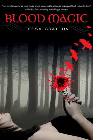

The cover on the left is hands-down my favorite. The girl, lying down with the blood bird things in her hands, just screams MAGIC! INTRIGUE! while the cover on the right is just... boring. I mean, sure, the rune and fire/blood setup is cool, but it doesn't draw me in like the one on the left. Also, the left cover is a subtle tie-in to the book, with the bloody birds and all, and the dark forest in the background is creepy and alluring.


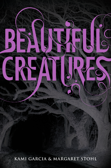
The first cover: Boring. It shows a certain level of mystery and occult, but it is... plain. The second cover doesn't really do it for me either, but just because I don't think it relates to the book very well at all. However, I do like the third cover. The eerie purple lighting gives off a certain air of mystery, while the lettering makes me think that the book is set in an older time period. The whole thing is eye-catching and appealing to the reader, and I think it just fits the book better than the others.


The second cover is probably my favorite, because I feel like it represents the book better than the first one, which looks girly and fake. Also, the second one has a more... dynamic feeling than the first one, and makes me want to read the book more than I normally would.


Hands down, definitely the second one. It is dynamic and eye-catching, completely unlike the first one, which is just a face. I can't say I really enjoyed the book, but I love love love the second cover.
Now for movie covers.

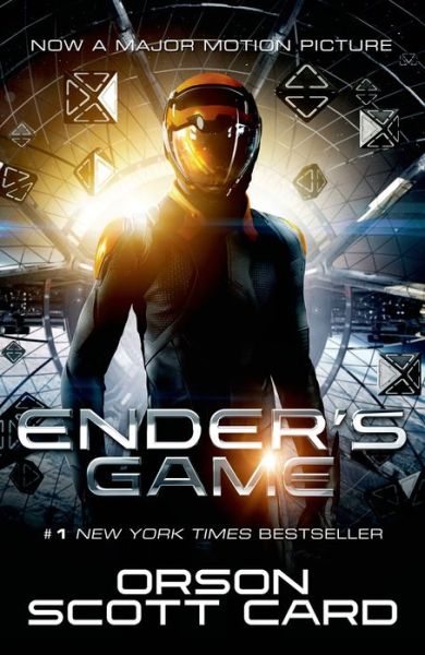
The first one is the version I read, and I can't say I like the cover. It seems plain, and not at all like the action-packed book. However, Version 2, the movie cover, is dynamic and lets us see the danger that being Ender represents, if you get what I'm saying. Anyway, the second one is definitely better.


For me, I like the first cover better, even though it really has next to nothing to do with the book. It's mysterious and alluring, and catches my eye and makes me want to rip it off the shelf and plow through it in four hours. The second cover, however, just screams CHEESY ROMANCE MOVIE, and when I look at it, I think, "Pfff, great. Another romance. Whoop-de-doo," and shows no promise of really anything actually happening.


Okay, the second one isn't strictly the book cover, but I did see it on a book cover at the bookstore, even if I wasn't able to find an image of the actual cover. But whatever. Anyway, I think the second book cover is my favorite- it just holds a certain allure that the first one doesn't have. I do like the first cover a lot, though, and it's pretty close competition.

I think this one is a tie. The first cover is marvelous in its simplicity, much like Twilight, bur the second one is eye-catching and... cool. I know that sounds weird, but it is. It's cool. I am glad they kept the title font for the second book cover, as well, because it's awesome. Just saying.

This one is a tie as well. I love the original cover, with the creepy eye and such, but I also like the movie tie-in cover. They both scream SCI-FI with the lens-flare type "ring" of sorts on each cover, and they are both slightly mysterious, the first one probably a little bit more than the second. But I think they both work for this book.
These comparisons are completely my opinion, and in no way are you required to feel the same way about any of them. Leave a comment below saying which is your favorite- I'd like to know!
No comments:
Post a Comment